Role
Visual & UI / Product Design



Timeline
6 Months

About the Product
The direction is a dark, high-contrast interface built around a signature red-to-amber gradient, sharp geometric accents, and dense data tables that stay legible under real trading conditions — order books, live charts, and balances all competing for the same screen.
Why it exists
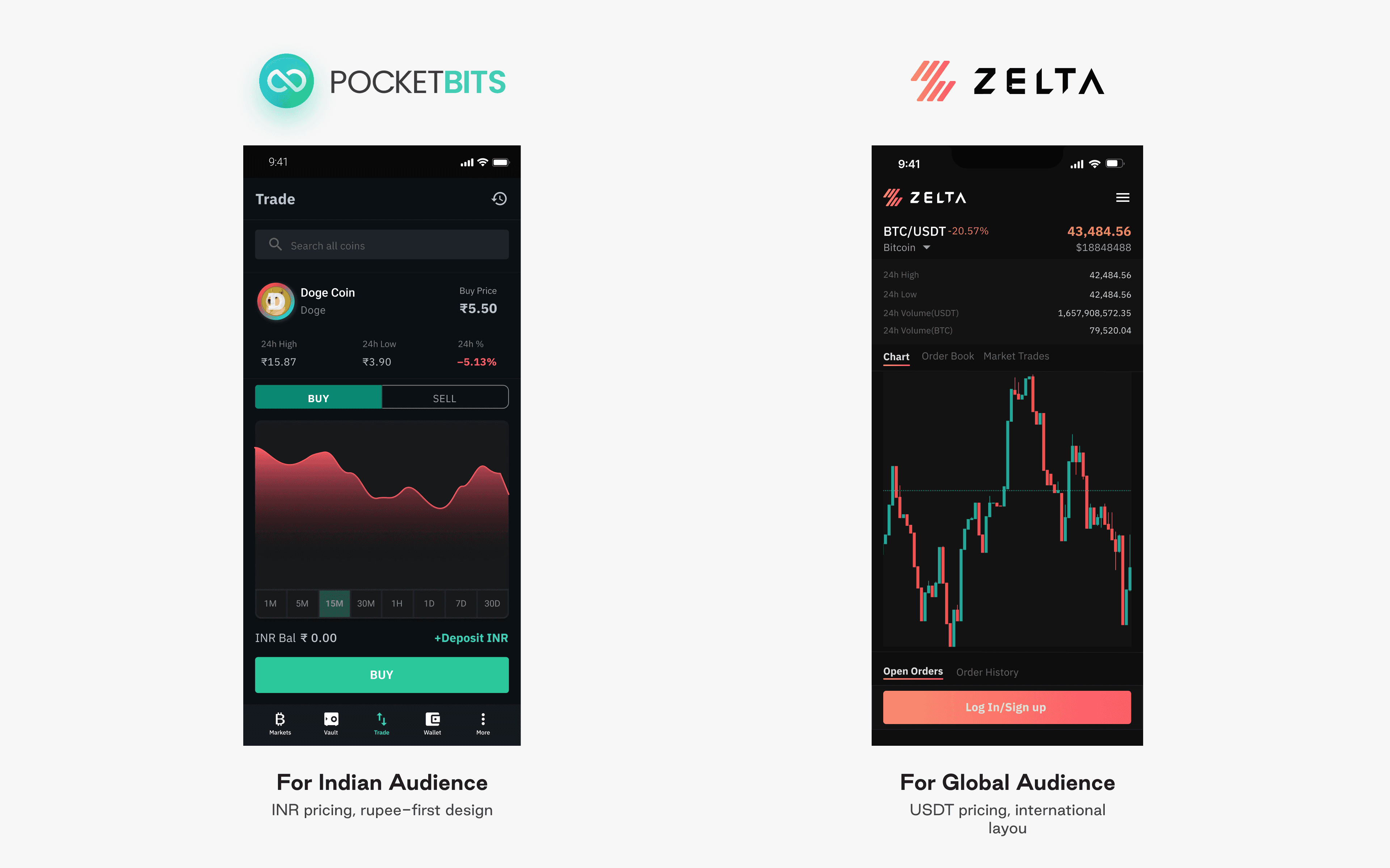
One Product, Two Markets: Designing Zelta as PocketBits' Global Counterpart
PocketBits already handles this well for crypto traders across India. Zelta started as a question rather than a brief: what would the same product look and feel like if it were built for a global audience from day one, instead of a regional one? Same core flows — trade, stake, hold — aimed at a different market with a different visual identi
⚖️
Different Regulatory Ground
PocketBits is built around India's crypto rules — TDS, KYC flows, FIU registration. A global product couldn't carry that same regulatory identity by name or design; it needed to stand apart from day one.
Сhallenge #1
💳
Different Regulatory Ground
UPI and INR balances are baked into PocketBits at a structural level. A global user has neither — so this wasn't a translation job, it needed different defaults built in from the start.
Сhallenge #1
Design Solution
Sign in
A split layout: generative 3D artwork on one side, a minimal credential form on the other — setting the visual tone before a user ever reaches the app.

Home & markets dashboard
Top gainers, top losers, and the full asset list in one scan — the landing surface for anyone checking the market before they trade.

Trading terminal
Chart, order book, open orders, and the buy/sell panel in a single view — the highest-stakes screen in the product, designed for speed and clarity under pressure.

Portfolio & wallet
Total asset value, allocation breakdown, and every held asset with quick actions — deposit, withdraw, trade, or earn — in one table.

01
Culture and audience shape a product, not just its features. PocketBits speaks India's language
rupees, UPI, patterns local users already trust. Designing for a global audience meant those defaults couldn't just carry over: currency, formatting, and small cultural cues all had to shift with the audience, not just the market.