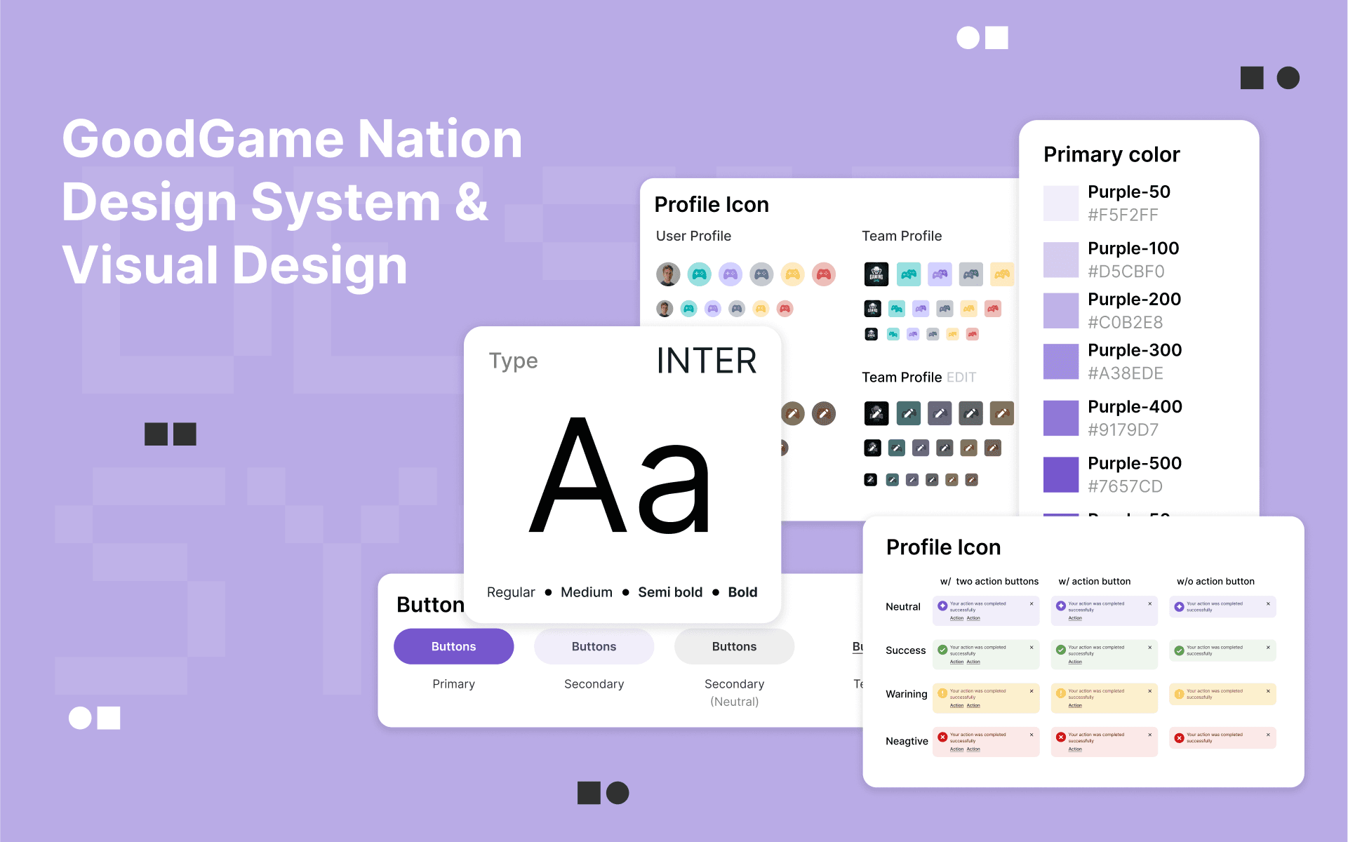
GG Nation: Visual and Design system
GGnation needed a unified design system to fix inconsistent interfaces and streamline workflows. Clear guidelines to help developers implement designs accurately and improve the overall user experience
Context & Background
text
Problem Statement
Visual Identity
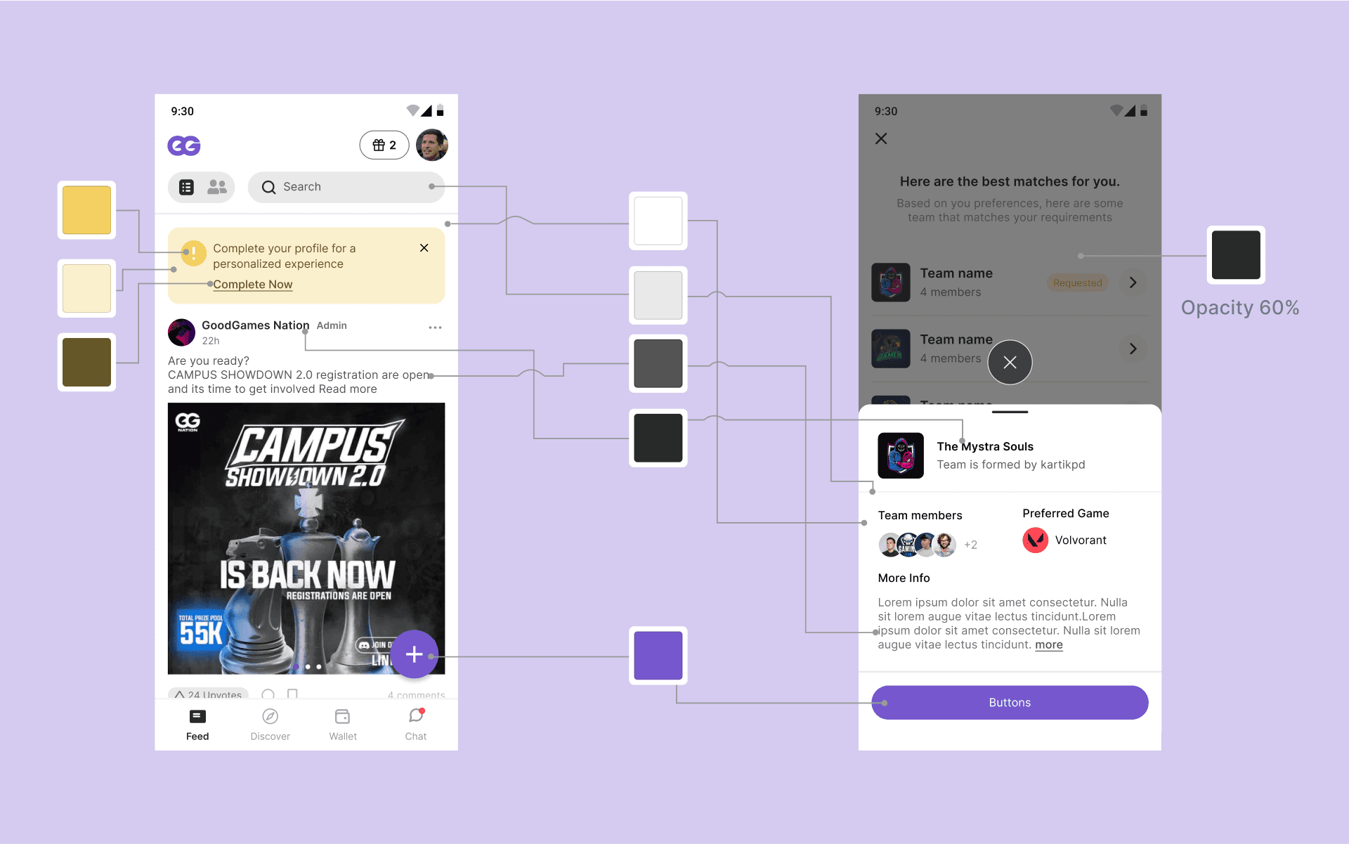
We started our design system by clearly defining our style essentials, including typography, colors, spacing, and iconography. This foundation ensured consistency across all components and created a cohesive visual language for the entire product.
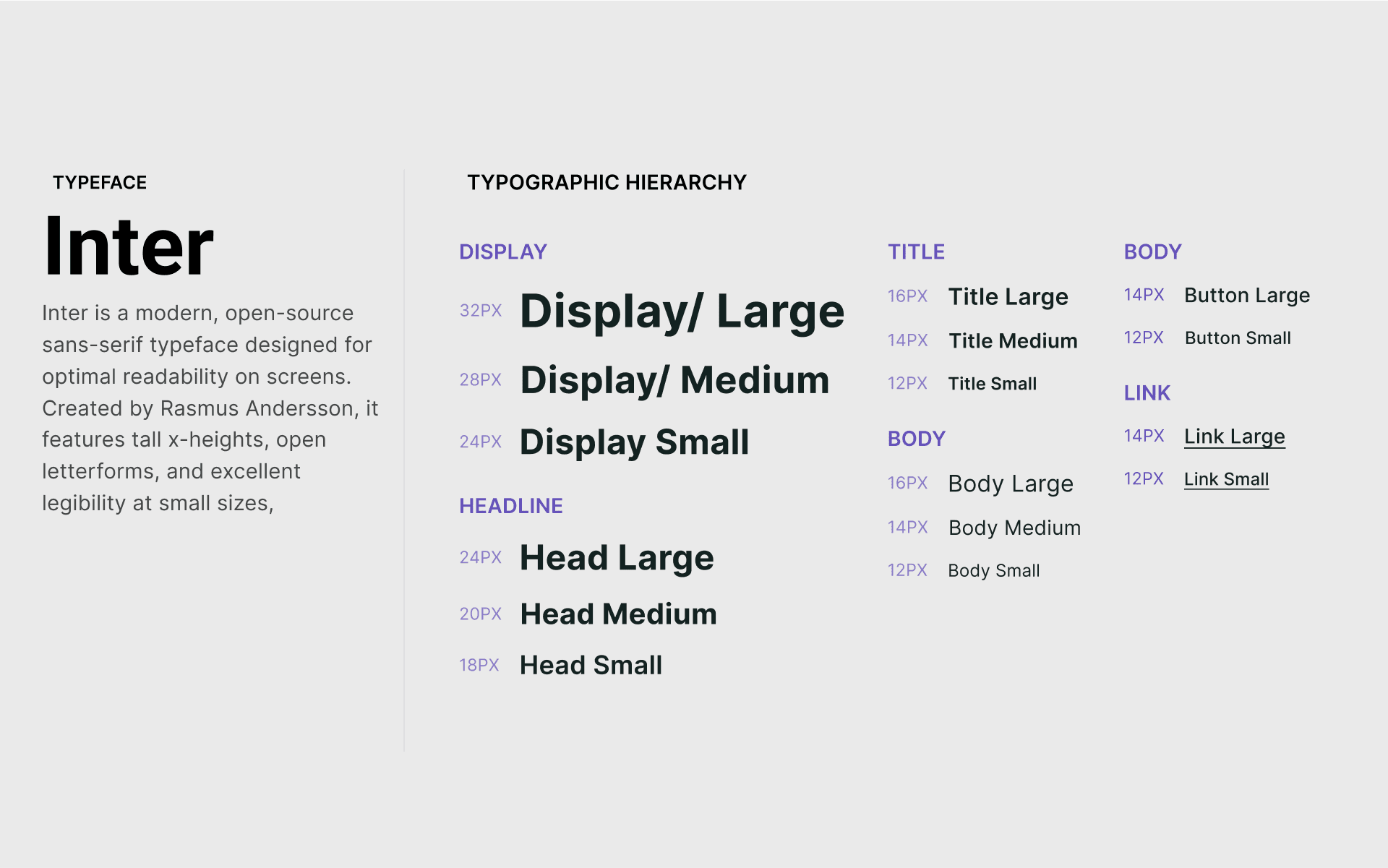
Typography
Due to time constraints, we couldn’t conduct extensive research on typeface, so we decided to use Inter, a widely trusted font designed specifically for digital spaces.
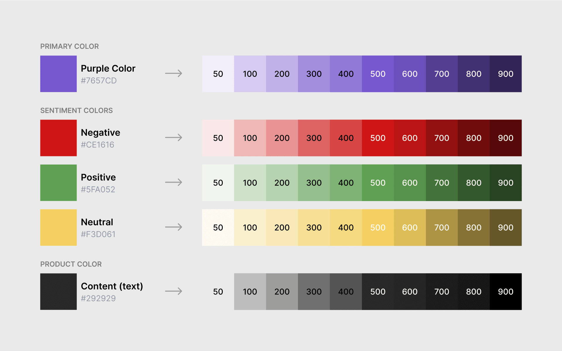
Colors
Defining colors early saved time and avoided rework. Like choosing the right font, setting clear color guidelines ensured a consistent, cohesive design across the project
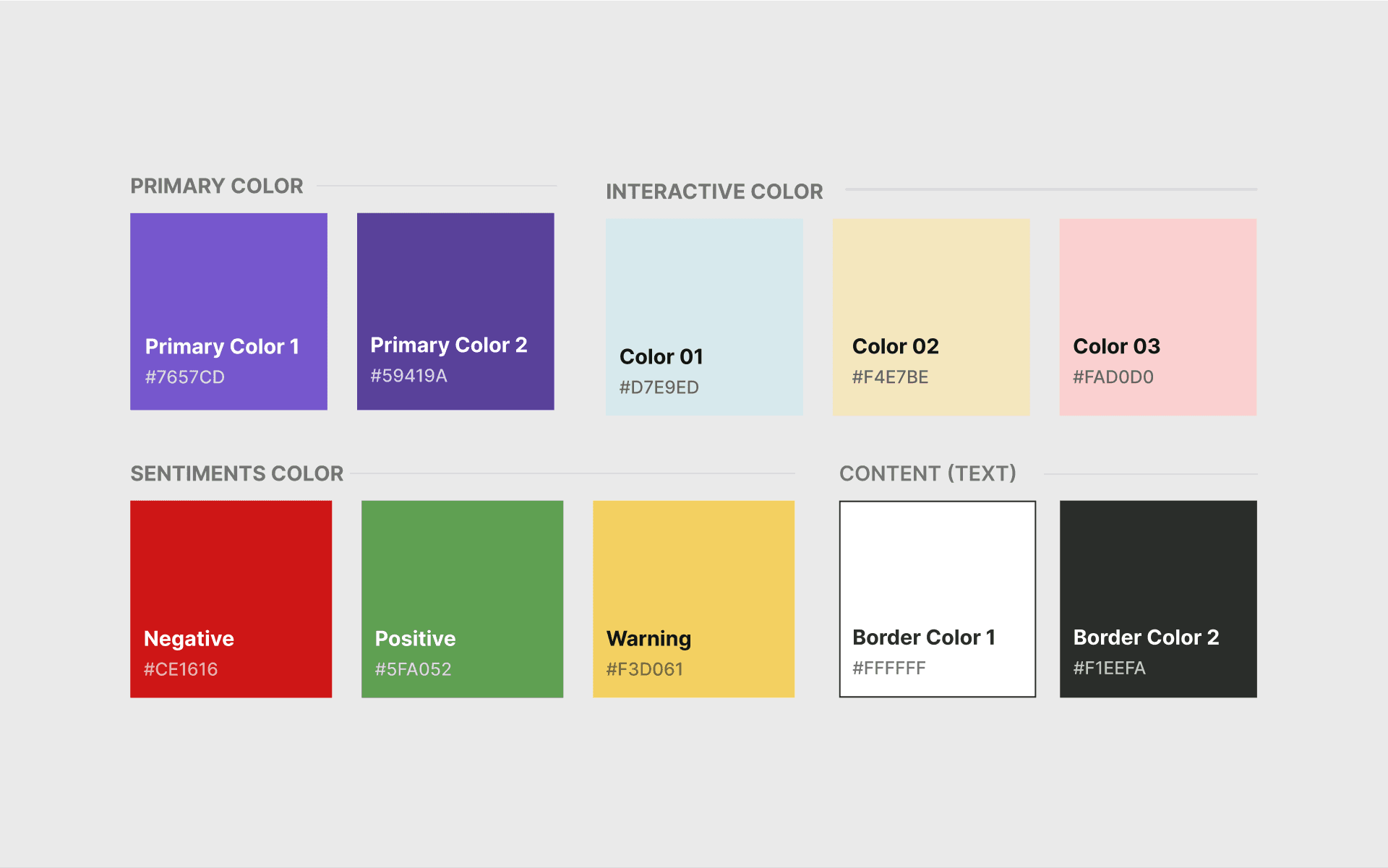
Later, I extended the foundation colors as suggested in Material Design to keep everything more consistent.
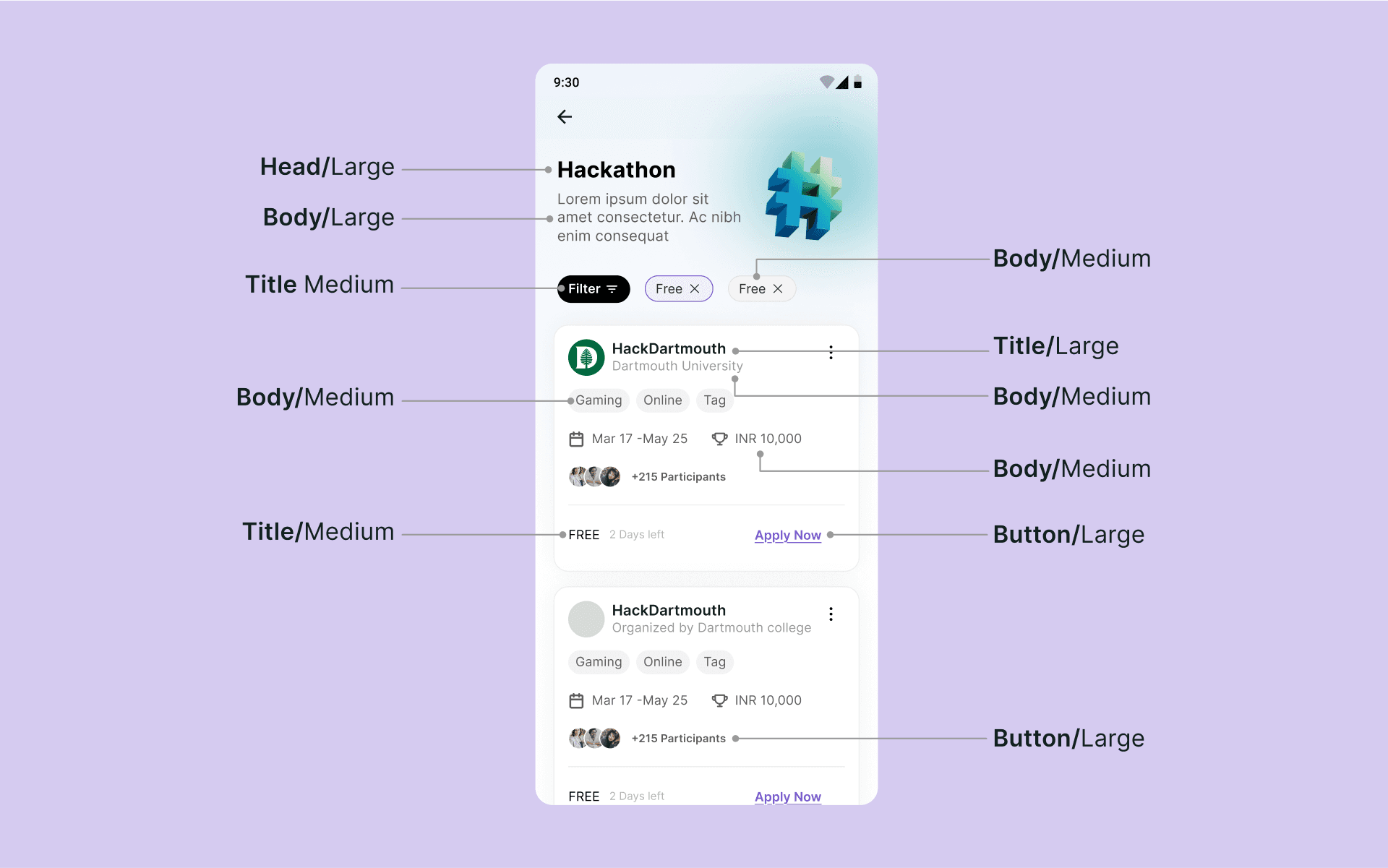
UI Components
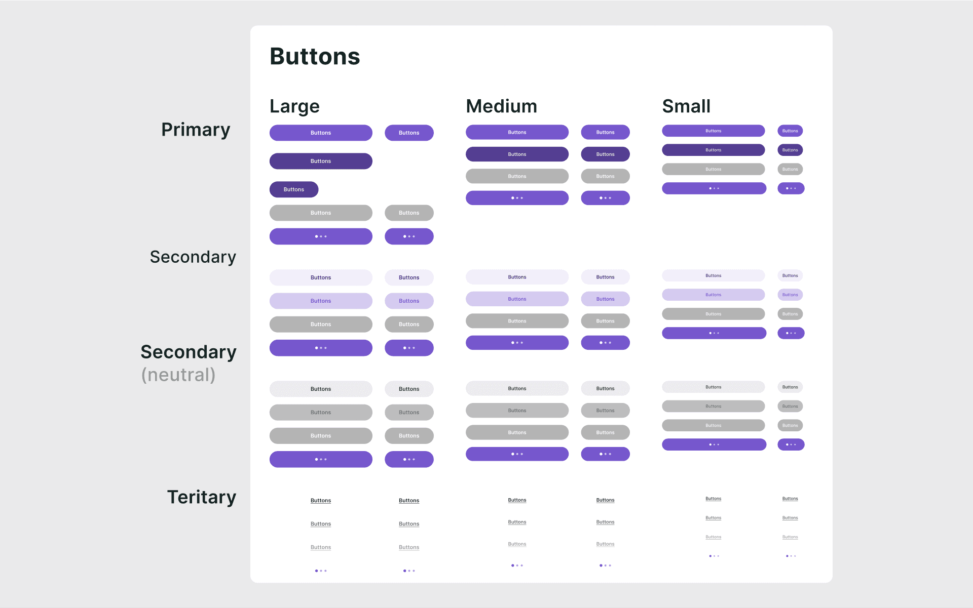
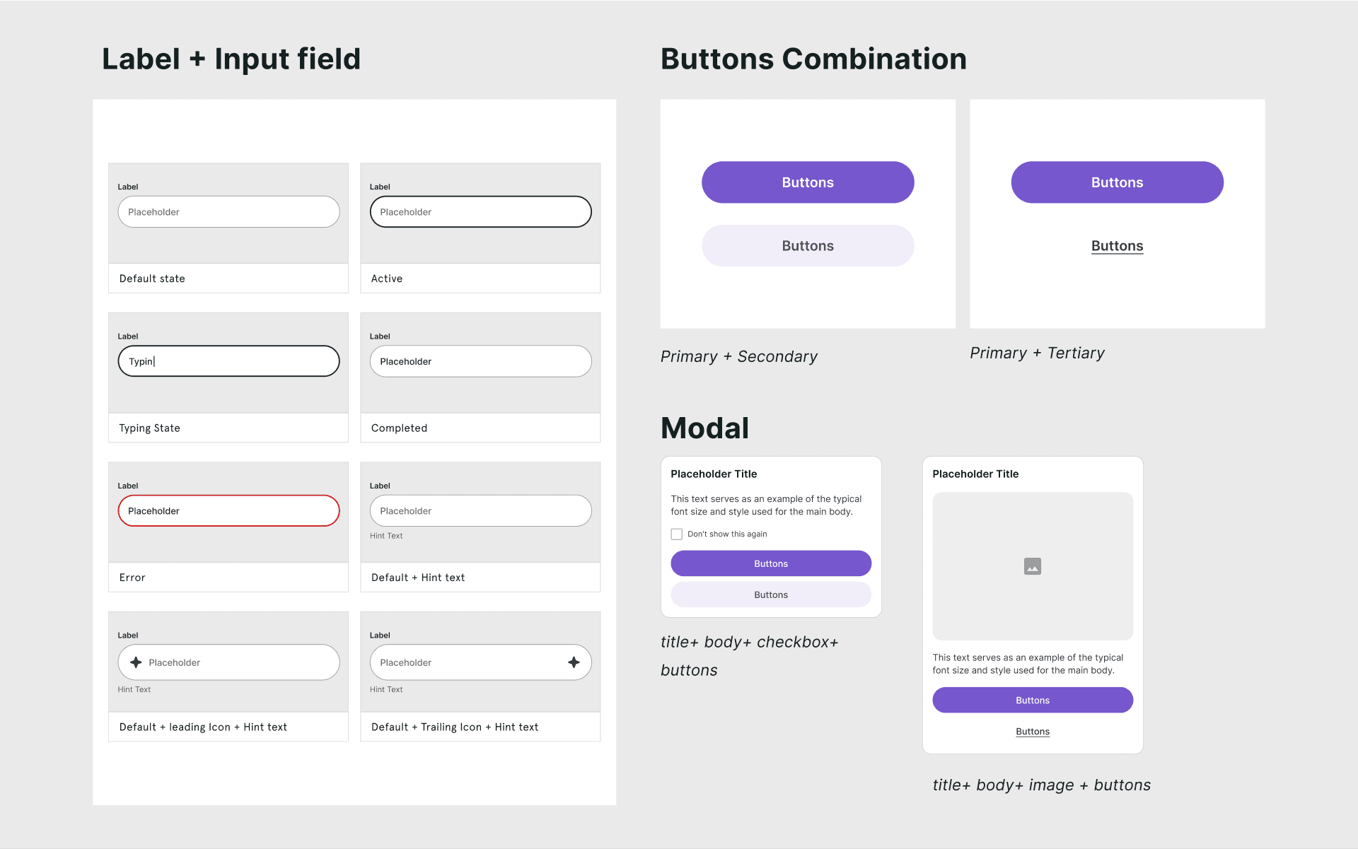
After defining the style guide, we started building the UI elements. This included creating buttons, input fields, cards, and other core components based on the established typography, colors, and spacing. Having a clear foundation made it easier to design elements that felt consistent and cohesive across the product.
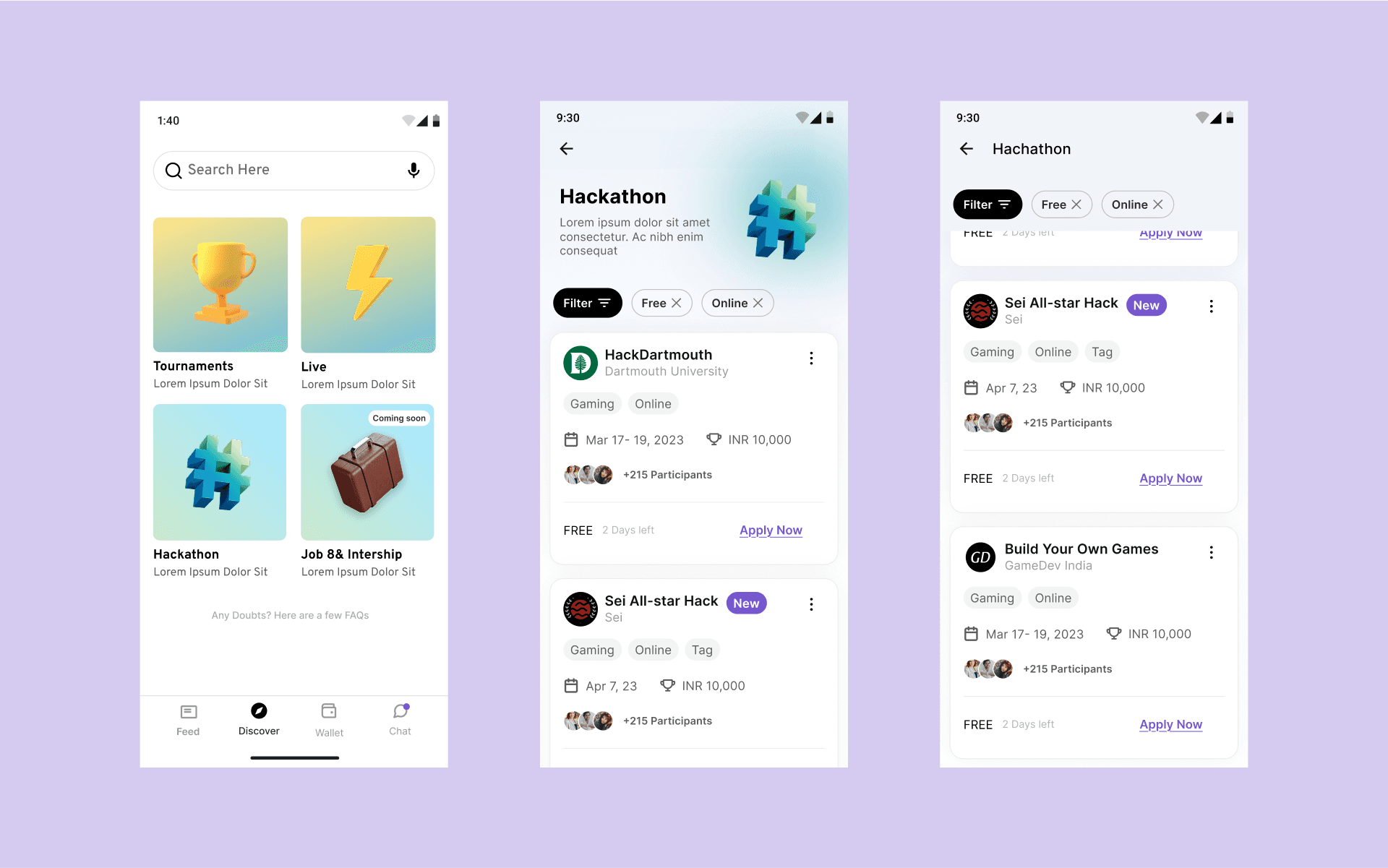
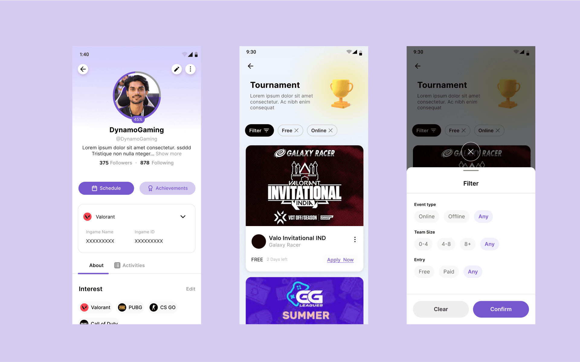
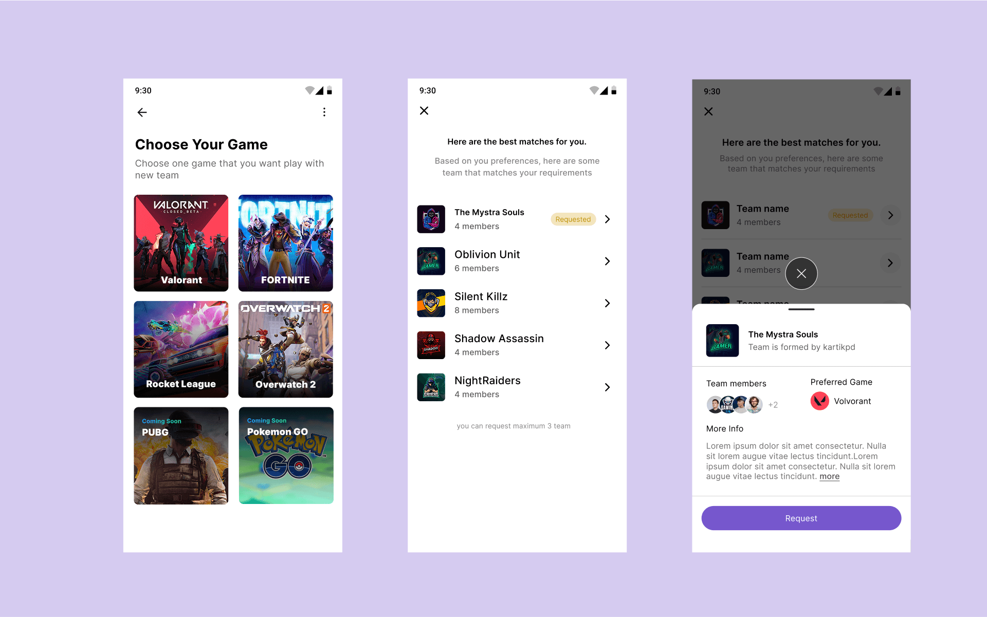
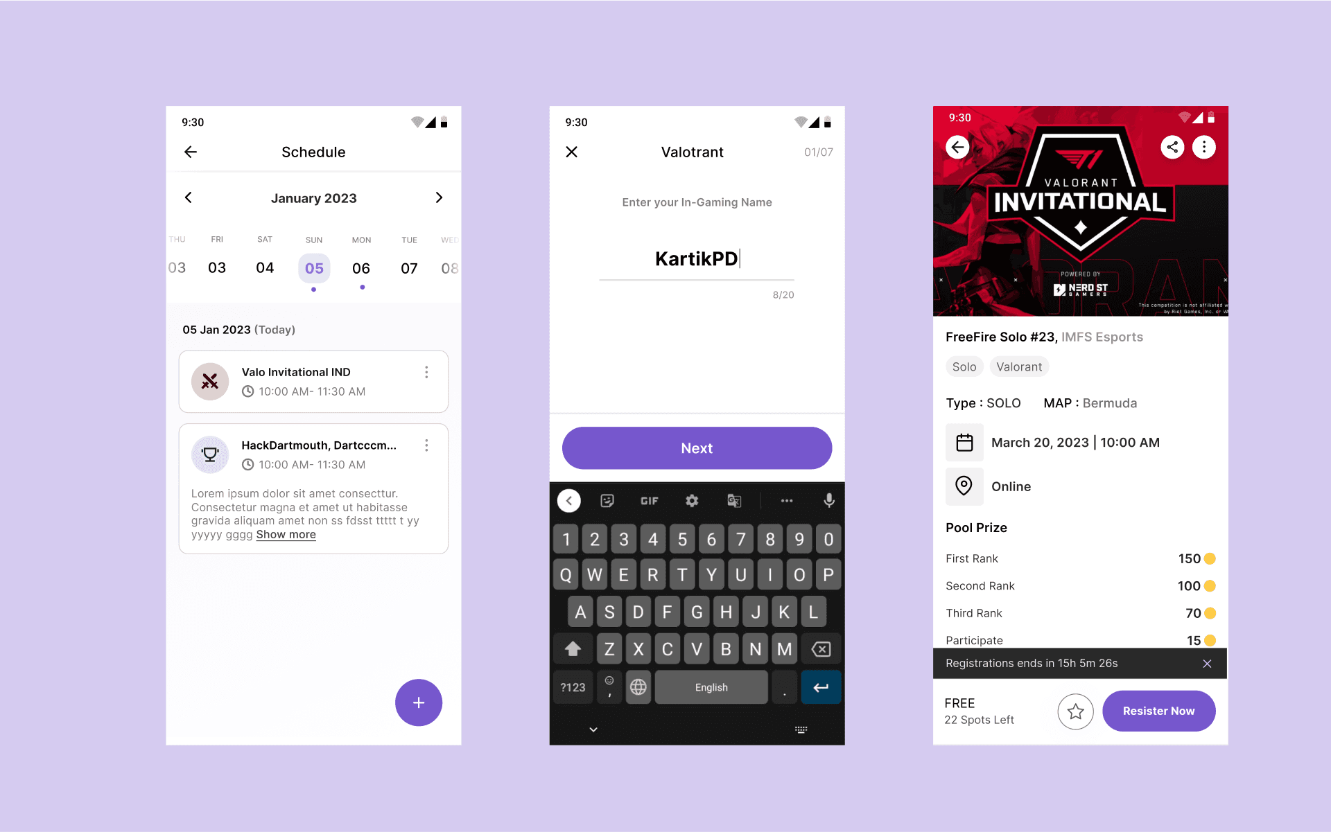
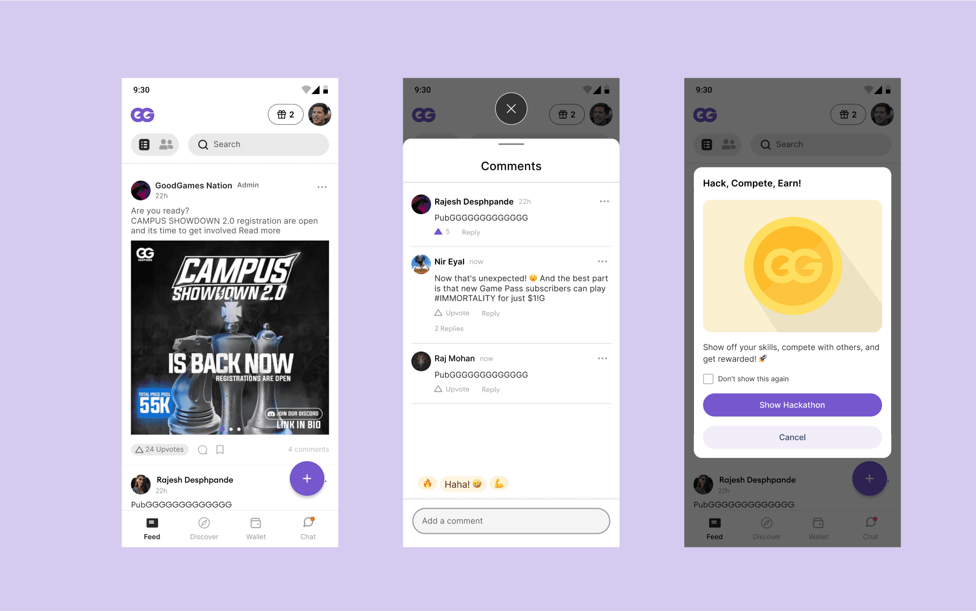
High-Fidelity Screens
The final visuals highlight the polished, high-fidelity screens built using the GGnation design system. This demonstrates how consistent styles, components, and interactions come together to create a cohesive and user-friendly experience across the platform.
See What Else I've Worked On
