Role
UX designer & Researcher
Timeline
4 Months

About the Product
Trial Nexus is a platform that connects patients with medical research studies (clinical trials), making it easier to discover promising new treatments and take an active role in their own care.
So it became clear the app had to evolve and we improved the entire experience.
PainPoints
So why did we need a fresh approach?
Most clinical trial platforms help patients find and connect with trials that match their health profile. But two things kept going wrong: patients were enrolling in trials they weren't actually eligible for, and patients who were a strong match for a specific trial were never finding it at all
Digging deeper, four core problems emerged
Wrong enrollments
Patients signing up for trials they
didn't qualify for
Problem #1
Missed matches
Eligible patients never finding the right trial
Problem #2
Language barrier
Medical jargon in trial listings with no plain-language translation
Problem #3
Misleading UI
Your profile matched 80%" shown to all users regardless of trial type
Problem #4
HMW Statement
How might we design a trial-matching experience that gives both non-clinical patients and medically informed users the right level of detail to accurately assess eligibility, without flattening that complexity into a single number?
Research
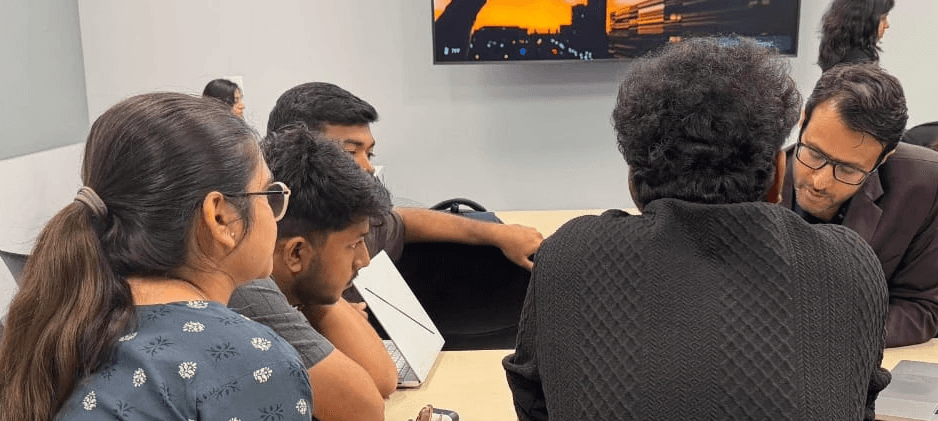
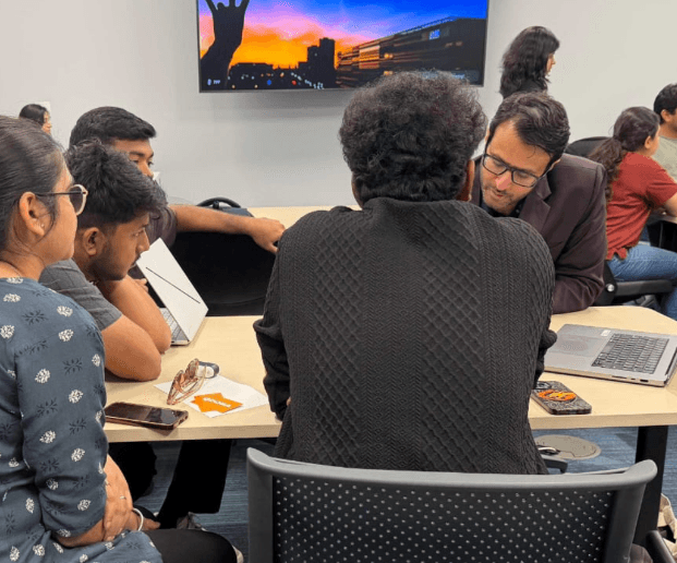
How I found it
Week 1
Field Observation
Visited a local clinic running an active trial after seeing a campus flyer
Week 2
Unstructured Interviews
Open conversations with a clinic coordinator and oncologists at Mayo Clinic, no script, following the thread of what they brought up naturally Chosen because I didn't yet know what questions to ask
Week 4
Competitive Analysis
Audited existing trial-matching platforms for UI patterns and failure modes
Want me to refine any of the wording here?

Key Findings
Text
Problem #2
Problem #1
Design Solution
For User who Has medical background
Design Solution
How I found it
Learnings
Throughout this project, several lessons stood out that shaped both our process and outcomes
01
Understanding our younger, tech-savvy users allowed us to tailor features specifically to their needs and behaviors.
02
Making key features, like the Vault, more accessible drove higher user engagement.
03
Testing multiple design iterations ensured we delivered a scalable and user-approved final solution.
0